
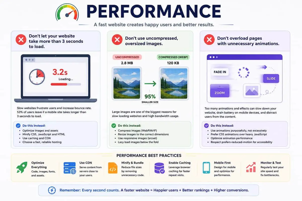
The Three-Second Rule
Every second of load time costs you conversions. Google's research shows that as page load time goes from 1 second to 3 seconds, the probability of bounce increases by 32%. At 5 seconds, it jumps to 90%. Amazon calculated that every 100ms of latency cost them 1% in revenue. For your business, the math is the same: slow websites lose customers.
Yet most websites fail the three-second test. The average mobile page takes 15 seconds to load on a 3G connection. The problem isn't your hosting — it's what you're sending across the wire and how the browser renders it.
The Image Problem
Images account for over 50% of a typical webpage's total weight. A single uncompressed hero image can easily exceed 2MB — more than the entire page budget recommended for sub-three-second loads. Here's what to do about it:
Choose the Right Format
- JPEG — best for photographs and complex images with many colors. Use quality 80-85 for an excellent balance of size and fidelity.
- WebP — 25-35% smaller than JPEG with the same visual quality. Supported by all modern browsers.
- AVIF — up to 50% smaller than JPEG. Modern format with growing browser support.
- PNG — only use when you need transparency. Never for photographs.
- SVG — ideal for icons, logos, and illustrations. Infinitely scalable at minimal file sizes.
Compress Everything
Never serve unoptimized images. Tools like Sharp (for automated pipelines), Squoosh, and ImageOptim apply lossless and lossy compression that can reduce file sizes by 60-80% with no perceptible quality loss. A hero image that ships at 200KB instead of 1.5MB is the single highest-impact optimization you can make.
Serve Responsive Images
The srcset attribute tells the browser which image size to download based on the user's viewport. A phone doesn't need a 2560px-wide image. Pair it with the sizes attribute and Next.js's built-in Image component handles this automatically:
<Image
  src="/hero.jpg"
  width={1920}
  height={1080}
  sizes="(max-width: 768px) 100vw, (max-width: 1200px) 50vw, 33vw"
/>
This alone can cut image bytes served to mobile users by 70%.
Lazy Load Below-the-Fold Images
Images that aren't visible on the initial viewport should not block the initial page load. Native loading="lazy" defers loading offscreen images until the user scrolls near them. Most modern frameworks include this by default — Next.js's Image component lazy-loads automatically.
Animation Overload
CSS animations and JavaScript-driven motion effects are the second-largest performance killer after images. Each animation forces the browser to recalculate layout, repaint elements, and composite layers. Too many simultaneous animations can drop frame rates below 30fps, making the page feel janky.
Prefer CSS Transitions Over JS Animations
CSS transforms and opacity changes are composited on the GPU and don't trigger layout recalculations. JavaScript animation libraries (animate.css, GSAP) offer more control but come at a cost — they run on the main thread and can block user interactions during animation:
/* Good — GPU-composited */
.element {
  transform: translateY(10px);
  opacity: 0;
  transition: transform 0.4s ease, opacity 0.4s ease;
}
.element.visible {
  transform: translateY(0);
  opacity: 1;
}
Limit Concurrent Animations
Animating more than 10-15 elements simultaneously on mobile devices will cause frame drops. Batch staggered animations using requestAnimationFrame and use will-change to hint browsers about upcoming animations. Libraries like Framer Motion are efficient, but avoid using whileInView on every card in a grid — instead, use a single intersection observer to trigger a batch reveal.
Respect Reduced Motion Preferences
Many users set their operating system to reduce motion. Honour this with the prefers-reduced-motion media query. Disable decorative animations entirely and keep only functional transitions (hover states, focus indicators):
@media (prefers-reduced-motion: reduce) {
  *, *::before, *::after {
    animation-duration: 0.01ms !important;
    transition-duration: 0.01ms !important;
  }
}
Measuring What Matters
You can't optimize what you don't measure. Core Web Vitals are the industry standard for real-world performance:
- Largest Contentful Paint (LCP) — should be under 2.5 seconds. Measures loading performance of the main content.
- First Input Delay (FID) / Interaction to Next Paint (INP) — should be under 100ms for FID, under 200ms for INP. Measures responsiveness to user input.
- Cumulative Layout Shift (CLS) — should be under 0.1. Measures visual stability as the page loads.
Tools like Lighthouse, PageSpeed Insights, and WebPageTest provide detailed reports. Set up a CI pipeline that fails builds when performance budgets are exceeded.
Practical Optimization Checklist
- Compress all images to JPEG quality 85 or equivalent WebP/AVIF.
- Resize images to their maximum display size — never ship larger than needed.
- Use responsive images with
srcsetandsizesattributes. - Lazy load every image below the fold.
- Replace JavaScript animations with CSS transforms and opacity transitions.
- Limit concurrent animated elements to 10 or fewer.
- Add
prefers-reduced-motionsupport. - Set up Core Web Vitals monitoring.
- Audit third-party scripts — each one adds latency and blocks rendering.
- Enable HTTP/2, Brotli compression, and CDN caching.
Performance is not a one-time fix. It's a discipline that must be maintained across every deploy. The websites that load in under two seconds are the ones users return to.